
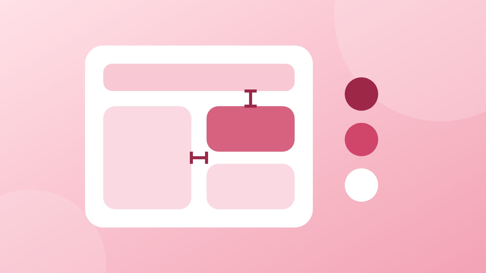
We've updated spacing and border-radius across Hubhus to give the interface a more modern, refined look.
What Changed
We've refined the visual design with updates to spacing between elements and border-radius styling throughout the platform. These changes bring a cleaner, more contemporary feel to Hubhus while maintaining the functionality you rely on.
Your Feedback Matters
Every workspace is different, and what works perfectly for one team might need adjustment for another. That's why we want to hear from you. If you have thoughts on the new design—what's working well, what could be improved—we're all ears.
Your feedback helps us fine-tune the experience for everyone. Tell us:
- 💡 What's working well in the updated design?
- 🔍 Is there anything that could work better for your workflow?
- 📋 Any suggestions for future improvements?
The Bottom Line
We're committed to making Hubhus better every day. This design refresh is one step forward, and with your feedback, we'll keep refining and improving to build the best possible experience for your team.
Questions or feedback? Reach out at help.hubhus.com